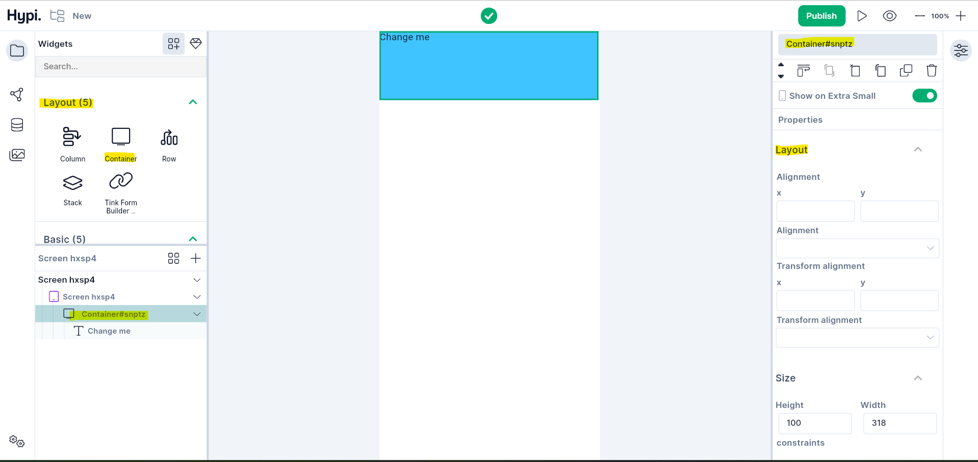
Container Widget
Overview
A container is a layout widget that facilitates common painting, decorating, positioning, and sizing of its child widget. It accepts just one child widget. You can change the background color and shape of the container. The shape can be a rectangle or a circle. And gradient colors can be applied to the background at certain angles. Height and Width parameters can be used to size the container.
Use Cases
- Container is quite useful to style the child widget.
- It can be used to give size and shape to the widget with gradient colors.
- It is a useful layout widget that can be placed inside other layout widgets like Rows or Columns. So, within a Row, you can have some containers placed horizontally one after the other.
Properties
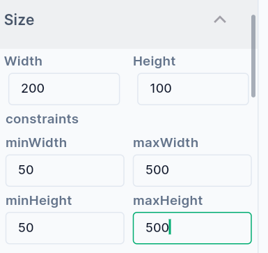
- Change the Size of the container by providing width and height. The values can be provided in terms of pixels.
- Set Minimum and Maximum width values.
- Set Minimum and Maximum height values.
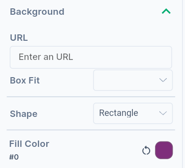
- Change the background of the container by providing fill color value.
- Provide an image URL to upload the image in the background.
- Choose BoxFit values to fit the child widget into the container.
- The Shape of the container can be Rectangle or Circle.
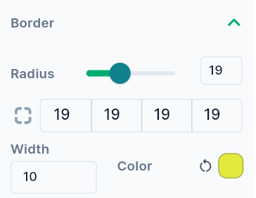
- For Rectangle, the circular corners can be provided by giving Radius values of all corners. It is also possible to make only one or two corners circular.
- Width of the border can be adjusted by providing the width value in pixels.
- If the content overflows the widget boundary, then there are the following ways to clip it.
- Anti Alias - It clips the edges to have a smoother look.
- Anti Alias with Save Layer - It clips with anti-aliasing and saves the Layer immediately following the clip. This process is slower than Anti Aliasing and is rarely used.
- Hard Edge - This is the fastest clipping with low fidelity. No anti-aliasing, or smoothening of edges applied.
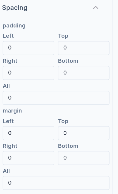
- Provide Margin values to create space around the outer border of the Container.
- Provide Padding values to create space between the child widget and the outer border of the container.
- The
Alignmentplaces the widget at a certain position inside the parent widget boundaries. The Position can be Bottom Center, Bottom Left, Bottom Right, Center, Center Left, Center Right, Top Left, Top Right, Top Center, etc. Choose the child widget position inside the button appropriately. X and Y coordinates can also be provided to position the child widget.
