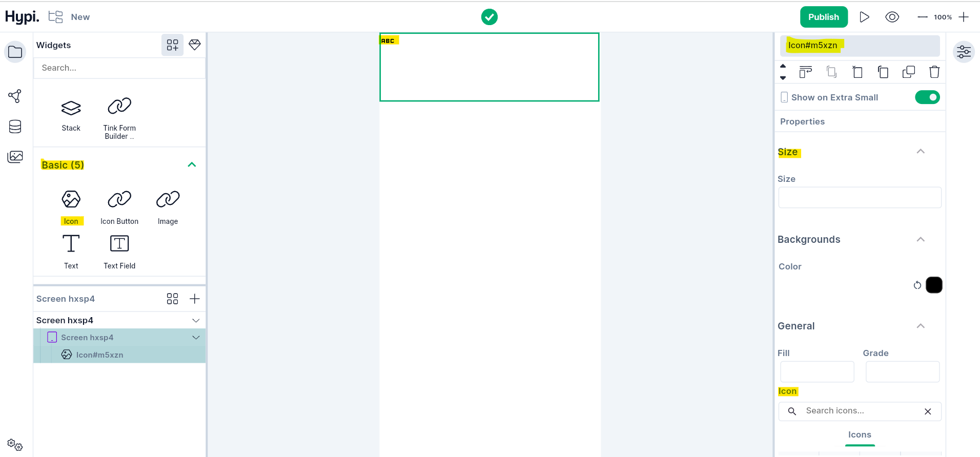
Icon Widget
Overview
Icon is a visual representation of a program, function, event, or any other important thing. It is available across various applications and platforms. Choose from hundreds of images from Hypi's Tink's icon collection to place on the icon widget. You can customize the icon by changing its color and size.
Use Cases
- Icon is generally not interactive unless it is placed on a button.
- Icons make the user interface appealing to the eyes.
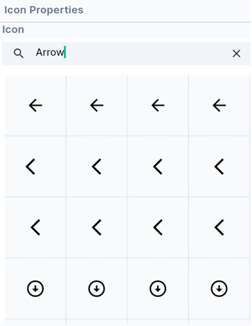
- Commonly seen icons are arrows for pagination, attachment icon to upload files, emoticons to express emotions, etc.
Properties
- Search for Icons from Hypi Tink’s Icon Collection
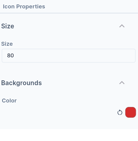
- Set the Size of the Icon with ease. Enter the size in pixels.
- Set the Color of the Icon. Choose the Color by clicking on the Color icon on the right side.
- Grade and Weight properties decide the thickness of the symbol. The Grade is the granular stroke weight for drawing the icon. The weight property means the weight of the Stroke while drawing the symbol.
- Attach a meaningful label called a Semantic label to the Icon.
- Set the Direction of the symbol. Choose Right to Left or Left to Right direction.